If you’re reading this blog post, you may have noticed some changes around The Incomparable. It’s been a long process that began with wanting to create a new design for member pages for our annual membership drive. That design process made me realize we needed to address larger issues with our branding, and after years of delaying, I finally pulled the thread and let the entire tapestry unravel.
The member-page redesign was done by Ste Grainer (thanks to Casey Liss for the referral!). Ste started working on three new member pages with a deadline of early May. Easy enough, right? Well, let me tell you…
While Ste was working on those pages, I followed the thread of that unraveled tapestry to a big issue: The Incomparable, once a podcast, is now a podcast and a podcast network, and it’s a bit of a mess to explain where one ends, and the other begins. Add to that the fact that Antony Johnston (The Incomparable’s de facto volunteer art director) and I felt the old Incomparable logo and type had gotten quite tired. An overhaul was needed.
So we followed that thread. I decided that I would rechristen The Incomparable as The Incomparable Mothership—already an informal title we use to refer to the ol’ girl—and use our classic zeppelin logo to represent it. (Kudos to David Brasgalla and Iconfactory for all our logo illustrations, dating back to 2013!)
I went to David Dooley of Yo Kyoto!, who has done a lot of design work for Relay FM lately, and asked him to reimagine artwork for The Incomparable Mothership and its corresponding members-only Special Edition.
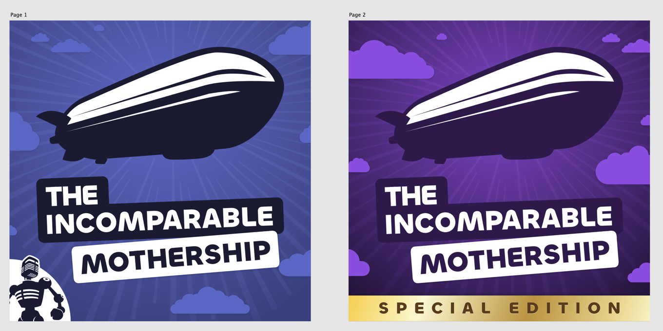
David’s designs blew me away—and he picked a new typeface that we loved, especially the NASA-worm-style “M”. We took this font back to Ste, who worked it into his web designs—which by then had expanded to include redesigning the entire Incomparable website.
In parallel, Antony was working on a new, subtler version of our network identifier “bug,” found in the bottom left corner of the show art. (It’s our robot mascot.) Along with deciding that the zeppelin would represent the Mothership podcast, I decided that our other bit of iconic art, the robot, would primarily represent the network.
With all this done, it came time to implement. As of this writing, we seem to have largely completed that process. There’s a new Topics page that lets you filter by category, though we have some work to do in going through our back catalog and categorizing topics! There are expanded people pages that show off more information about hosts and panelists. This blog has been brought back to life. And there are sure to be a few easter eggs here and there, too.
So thanks to Ste, Antony, David, and all the people who make The Incomparable run. And, of course, thanks to everyone who listens to our podcasts—whether or not you read our website.
—Jason Snell